
Recommended Bohemian Printed Carpets for a Boho Chic Living Space
2026-10-09
Transforming a living space into a boho chic sanctuary often starts from the ground up—literally. Bohemian printed carpets are the unsung heroes of eclectic interiors, weaving together bold patterns, faded textures, and stories from far-flung markets. If you’ve been scrolling past countless lookalike rugs, wondering how to choose one that truly anchors your free-spirited decor, this guide is for you. We’ve handpicked carpets that don’t just fill floor space; they set the entire room’s rhythm. And because style should never come at the cost of a headache, Senseco has tested every recommendation for durability, dye quality, and that effortless “found it in a Marrakech souk” vibe. Ready to give your living room the layered, lived-in warmth it deserves? Let’s roll out the options.
What Makes a Hand-Knotted Look the Heart of Boho Decor
A hand-knotted piece carries the weight of slow, imperfect craft. The slight variations in knot size, the almost imperceptible shifts in dye saturation, the way the weave tightens and loosens across the surface—these are not flaws. They are the fingerprints of the maker, and they give a room the kind of warmth that machine-made textiles can only imitate. In a boho space, that honesty matters more than precision.
This kind of textile also works as a quiet anchor for the more chaotic, layered energy that defines boho decor. Worn leather, rattan, fringed throws, and collected ceramics all compete for attention. A hand-knotted rug or wall hanging gives the eye a place to rest without feeling sterile. Its dense texture and subtle irregularities create depth that pulls the whole room together, even when the surrounding pieces seem mismatched at first glance.
There is also something stubbornly personal about hand-knotted work. It does not follow a trend cycle. It fades, softens, and adapts to the life happening around it. Over years, a hand-knotted piece collects stains, sunlight, and the memory of feet and hands, which only deepens its presence. That lived-in quality is exactly why it feels like the emotional center of a boho interior—less like decor and more like a story you can touch.
Print Pairings That Keep Eclectic Rooms Feeling Calm
Mixing prints in a room full of treasures doesn't have to feel chaotic. The trick is to anchor the space with a single large-scale pattern that carries the room's dominant color, then introduce smaller motifs that echo its undertones. A faded botanical on the curtains, for instance, can sit happily beside a narrow stripe on a chair if both share the same soft sage or dusty blue. This quiet repetition gives the eye a place to rest, even as it wanders from one textile to the next.
Think of pattern pairings as a conversation rather than a competition. One print should lead, while the others murmur in agreement. A bold ikat on a bench cushion works best when its neighbor is a delicate geometric or a subtle tone-on-tone weave. Avoid pairing two large-scale patterns of equal visual weight, as they tend to argue. Instead, vary the scale, and let the room's neutral walls or wood floors act as a buffer. The result feels layered but not loud.
Calm emerges when every print feels like it belongs to the same family. You can achieve this by repeating a single accent color across different motifs: a rust-red leaf in one fabric, a thin rust pinstripe in another, a rust-tinted floral in a third. The prints don't need to match; they simply need to share a visual thread. Add plenty of solid-colored throws and unpatterned surfaces to break up the busyness. In an eclectic room, the quiet moments between prints are what let the whole composition breathe.
Sizing Tricks for Small Apartments With Big Pattern Energy
Most people assume small apartments need tiny prints, but that's exactly backwards. A single oversized pattern—whether it's a floral wallpaper on one wall or a chunky geometric rug under the coffee table—gives the eye a clear focal point and actually makes the room feel more intentional. The key is to let that one bold element breathe: keep surrounding furniture solid or texture-only, and resist the urge to add other competing patterns in the same sightline.
Vertical surfaces are your best friend when you're working with limited floor space. A tall headboard upholstered in a large-scale print, or floor-to-ceiling curtains with a wide stripe, pulls the gaze upward and tricks the ceiling into feeling higher. If you're nervous about commitment, start with a big patterned throw or a set of oversized pillows on a neutral sofa—they bring the same energy but can be swapped out when your taste shifts.
Color intensity matters more than pattern size. A huge damask or ikat in soft, tonal shades (think dusty blue on cream, or charcoal on greige) reads as texture rather than visual noise, so it won't shrink the room. Steer clear of high-contrast combos like black and white at full saturation if your apartment gets little natural light. Instead, borrow one color from the pattern and repeat it in a solid vase, a lamp shade, or a piece of art to tie the whole space together without adding clutter.
A Case for Faded, Sun-Washed Rugs Over Crisp Replicas
There is a particular honesty in a rug that has spent years underfoot, its colors softened by sunlight and its wool worn smooth by daily life. Those faded, sun-washed pieces carry a quiet record of the rooms they have known—a pale patch near a doorway, a gentle unevenness where furniture once sat. They do not announce themselves the way a factory-fresh replica does; instead, they settle into a space like an old friend, offering warmth that feels earned rather than manufactured.
Crisp reproductions can be beautiful in their own right, but they often miss the accidental poetry of age. A new rug printed with a traditional motif might have perfect symmetry and bright, unblemished dye, yet it lacks the story that comes from years of exposure. Sun-bleached wool, once deep indigo or madder red, fades into shades no designer could deliberately replicate. That soft, dusty palette—somewhere between lavender, sand, and smoke—gives a room a sense of ease and continuity that a stark, flawless copy rarely achieves.
Choosing faded over fresh is also a small act of resistance against the idea that everything must look untouched. These rugs ask you to accept imperfection as part of their value. A worn edge, a slight stain, a patch of uneven dye—each mark is evidence of a life lived, not a flaw to be hidden. In a world of mass-produced interiors that all start to look the same, an old sun-washed rug offers something harder to find: a surface that has already learned how to age gracefully, and will continue to do so alongside you.
Blending Kilim Stripes and Floral Borders Without Clashing
Start with the colors that already talk to each other. Pick a muted terracotta or deep indigo from the floral border’s petals and let that same tone appear in one or two of the kilim’s narrow stripes. When both patterns share a hue, the eye moves between them without stopping at a hard boundary.
Give the two patterns different jobs. Let the kilim stripes carry the bold, horizontal rhythm near the center of the room, and keep the floral border as a softer frame rather than a competing band. If the flowers are large and loose, tighten the stripe spacing; if the kilim bands are wide and assertive, choose a border with smaller blooms and more background space.
A narrow solid band in a neutral tone, like undyed wool or faded slate, can sit between the stripes and the flowers. That thin pause keeps the pairing from feeling crowded. You can also repeat a tiny floral sprig inside an otherwise empty kilim stripe, so the two motifs nod to each other instead of shouting over one another.
The Low-Maintenance Appeal of Distressed Cotton Flat-Weaves
There’s a quiet confidence in a rug that already looks a little worn-in. Distressed cotton flat-weaves skip the preciousness of a high-pile carpet and instead offer a surface that practically asks for real life to happen on top of it. You don’t have to tiptoe around this floor covering; spills, scuffs, and the daily shuffle of feet only add to its character. Because the fibers are tightly woven and low-profile, dust and crumbs don’t bury themselves deep the way they do in plush piles. A quick shake outside or a light vacuum keeps it looking intentional rather than neglected.
Upkeep here is less about chasing perfection and more about letting the material do its job. Cotton is naturally forgiving: most small stains lift with a damp cloth and mild soap, and the distressed finish means you won’t spot a tiny bleach mark or a sun-faded patch as a flaw. The flat weave also resists snagging from pet claws and chair legs far better than looped or shag alternatives. For busy households, that translates into less time hovering with a stain remover and more time simply living on the rug. If a section gets truly dirty, many of these pieces are light enough to toss in the wash or take to a professional without a logistical headache.
What often gets overlooked is how this low-maintenance nature shifts the whole room’s mood. When you’re not guarding a rug from everyday traffic, the space feels more relaxed. A distressed cotton flat-weave absorbs the small accidents of daily life and turns them into texture rather than trouble. That’s the real appeal: it’s not just easy to care for, it’s easy to live with. You get the softness and visual warmth of a textile underfoot without the unspoken rule that it must stay pristine. Over time, the rug doesn’t decline—it settles in, a little more comfortable with every passing week.
FAQ
It’s all about the imperfect, collected-over-time feel—think faded medallions, tribal motifs, uneven borders, and a mix of warm, earthy dyes rather than crisp, uniform patterns.
Go for terracotta, mustard, olive, rust, dusty rose, and cream. These tones sit well with rattan, macrame, and lots of plants without overpowering the space.
Yes, but keep the scales different. If the carpet has a large central motif, use smaller geometric or striped pillows. Sticking to a shared color family helps everything feel intentional rather than chaotic.
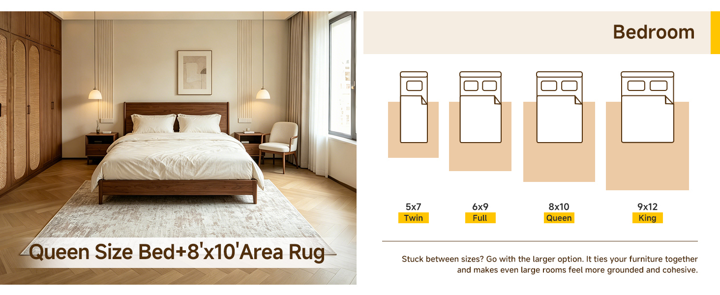
Aim for a rug large enough that the front legs of your sofa and chairs rest on it. In smaller rooms, a 5x8 or 6x9 often works; open layouts can handle an 8x10 or larger to anchor the seating zone.
Wool and cotton flatweaves are great for that worn, breathable feel. Wool adds softness and durability, while cotton kilims give a lighter, vintage-inspired look that’s easy to move around.
Vacuum gently without a beater bar, blot spills immediately with a clean cloth, and rotate the rug every few months. For deeper cleaning, use a rug-safe shampoo or call a professional who handles dyed textiles.
Definitely. It softens clean lines and adds warmth. Pair it with a simple sofa, a low wooden coffee table, and some woven baskets for a balanced, lived-in feel.
Try layering it over a larger jute or sisal rug, angling it slightly for a casual look, or using a smaller one as wall art above a daybed or entry bench.
Conclusion
In a boho chic living space, the rug often sets the tone before a single pillow is fluffed. A hand-knotted look—whether genuine or convincingly printed—anchors the room with that imperfect, human touch that mass-produced decor can't fake. Pairing busy florals with quiet geometrics sounds risky, but the trick is to let one pattern breathe while the other hums in the background; think of a faded Persian-style print under a chunky knit throw. For small apartments, don't shy away from big motifs—instead, choose a rug with an open, airy layout so the pattern feels like a statement, not a shout. Borderless designs or low-contrast colors keep the floor from swallowing the room.
There's a reason sun-washed rugs hold more charm than crisp replicas: their softness tells a story, and that story makes a space feel lived-in rather than staged. A faded floral border against a kilim stripe might seem like a collision, but when both are muted by time or clever printing, they settle into a happy truce. Distressed cotton flat-weaves earn their keep in a boho home because they invite bare feet, spilled tea, and the occasional pet nap without demanding a deep clean every week. Their low profile slides under doors and furniture, which is a blessing in tight city flats. Go for a rug that looks like you found it at a market in Marrakech, not one that arrived in a plastic wrap.
Contact Us
Contact Person: Ivy Yin
Email: [email protected]
Tel/WhatsApp: +86 18519681805
Website: https://www.sensecomarketing.com/